Photo via Adobe Stock
Turn Your Cause Into a Brand People Remember
Standing out on social isn’t about volume — it’s about identity. When your nonprofit speaks with the same voice and shows up with the same look across platforms, people start recognizing you before they even read. That’s not branding fluff — that’s trust in motion. A consistent voice and visual style act as shortcuts to credibility, helping your message land faster and more often. If your presence feels scattered, it’s time to build one that sticks.
Understand the Basics: Voice Is Constant, Tone Is Contextual
Too many teams confuse brand “voice” with tone. They’re not interchangeable. Voice is your baseline identity — how your nonprofit sounds, what kind of language it uses, and what emotional frequency it operates on. Tone, however, flexes depending on the situation. The key is to remain consistent in core voice while allowing tone to shift appropriately across messages.
If you’re not sure how to start, begin by distinguishing voice versus variable tones. It’s a strategic decision, not a copywriting flourish. When everyone on your team — from social media manager to executive director — shares the same foundational voice, you stop rewriting everything from scratch and start building recognition with every post.
Brand Recognition Builds Real-World Trust
Supporters don’t just donate to causes — they donate to organizations they believe in. That belief doesn’t form in a vacuum. It’s shaped by what you say, how you say it, and whether that message holds steady across touchpoints. One Instagram post might spark curiosity. A newsletter follow-up could lead to a share. But it’s the repetition of voice and identity that creates the credibility to act.
There’s a direct connection between how identity increases donor confidence and the results you see during fundraising pushes. When people recognize your visuals and tone instantly — when your posts sound like you — they stop needing to ask, “Who is this?” That clarity clears the path for trust.
Internal Consistency Starts with Clear Guidelines
Visual identity isn’t just a logo. It’s colors, fonts, layout preferences, image style, spacing, and even what not to post. When you combine that with clear brand voice guidance, you get the ingredients for true cohesion. But these elements must be documented and accessible — not just something the design team keeps in their head.
Build a living brand system that can guide internal voice and visual standards. Give your interns and volunteers what they need to create content that sounds like you and looks like you — without heavy handholding. It prevents mismatched design. It makes onboarding smoother. And it cuts down on friction between departments.
Social Platforms Don’t Need Uniformity — They Need Alignment
Posting the same thing across platforms may feel efficient, but it often backfires. Each platform carries its own norms and content types. LinkedIn expects context. Instagram expects visual pop. Facebook favors community storytelling. If you treat them all the same, you’re not leveraging their strengths — you’re diluting your presence.
The goal isn’t to clone content, but to adapt it well. Look at examples showing brand applied well across platforms to learn how nonprofits shape content formats without losing identity. Use the same voice, swap the storytelling style. It works. The story flexes, the identity stays firm.
Consistency Moves the Numbers
Branding isn’t abstract. When done right, it shows up in your analytics. Post reach goes up. Engagement rate jumps. Donor return rate increases. A consistent brand doesn’t just look better — it performs better. One case study showed how a nonprofit’s rebrand directly contributed to a social engagement spike, website visit increases, and greater donor reactivation.
That’s not coincidence. It’s proof that branding success leads engagement jump. Cohesive branding means each post carries more than its own weight — it reinforces every post that came before. The effect builds. The metrics follow.
Avoid the Friction: Inconsistency Costs You
The most damaging brand mistake isn’t bad design — it’s scattered identity. A post that sounds like one person, followed by a video that sounds like another, erodes trust. So does a visual style that shifts too frequently. Your audience may not articulate it, but they feel the inconsistency.
You don’t need a design degree to fix this. You need clarity and repetition. Keep your visuals tight and your voice tighter. Pay attention to risks of inconsistent messaging and visuals and treat them like technical debt. Because if you don’t fix the fractures, they multiply — and eventually, they’ll show up as lost donors, not just clunky posts.
Where DIY Meets Identity
If you’re building your brand voice and visuals in-house, Adobe Express offers a nonprofit-friendly way to stay consistent without always outsourcing. It’s not a substitute for pro design — but it complements it beautifully, filling the gaps between big projects or campaign launches. These free and easy-to-use options can give your social channels a unified, polished feel — without becoming a second job.
- Create standout posts with memorable design that feels intentional even if you’re starting from scratch or rebranding on the fly.
- Keep your messaging tight across platforms using their built-in scheduling and content rhythm to stay on mission without scrambling daily.
- Turn updates or event recaps into scroll-friendly story snapshots that feel human, visual, and on-brand.
- When your message needs visual clarity, you can quickly translate it into attention patterns people actually follow — not just another chart.
Every post you publish teaches people what to expect from you. When your voice shifts and your visuals wobble, you lose more than style — you lose recognition. But when everything aligns, your brand becomes unmistakable. That’s when people start remembering, sharing, and backing what you do. Cohesion isn’t just design; it’s momentum.
Heron Design helps small businesses and nonprofits turn their story into a full marketing system — built to match your voice, stretch your budget, and move people to act. This article was written in partnership with Adobe.
 I’m Leslie Smith, I own Heron Design. I’ve worked in marketing & communications for three decades, and started my company 18 years ago. I love helping clients realize how much power they have in creating their own lifestyles. I believe that the right branding & marketing can open a whole new world for a business owner.
 Starting without a plan. Not having a clear marketing strategy overall for their business, and what role, exactly, their website needs to play.
  If you’d like to learn more about how I can help you, call my office at (423) 402-0422 or email me at
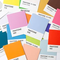 Your color selection process should start with your logo, then take into account your existing marketing pieces. We suggest 3-5 colors as your base palette, then choose a contrasting color – think opposites on the color wheel – for your ‘call to action’ buttons.