This is the #1 Branding Mistake I See New Businesses Make

This is the #1 Branding Mistake I See Small Businesses Make with embarrassed woman looking sideways

What’s the #1 branding mistake new businesses make?

Creating your ‘look’ too early.

Before you put time & money into your logo, website, or ads, there are marketing decisions you need to make. There’s a process, based on psychology, to create the right branding for your business.

When you get it right, you attract the right prospects into your business. Generating leads – and sales – becomes much simpler.

But if you get it wrong, you’ll turn the right prospects off – and they may not even realize why.

From our colors and fonts, to our logo, to the photo shoot that really made us realize my dream is a reality, to the website – thank you so much for helping bring to life the vision that I had for our event space.
– Rhonda S

Leslie Smith with client
I’m Leslie Walters Smith, owner of Heron Design.

I’ve created marketing & branding for small business for 30 years, the last 22 with my own company. I’ve built over 200 websites, designed countless logos and branding packages, and written over a million words of persuasive marketing copy.

If you’d like to learn more about our work and check out our portfolio, use the links in the navigation menu above under “What We Do” and “Our Work.”

Over the years, I’ve learned the hard way that effective branding takes more than a pretty picture, even if the business owner absolutely loves it.

But …. when you create your marketing foundation first, and build your branding on that? It changes everything. You’ll have a look that’s psychologically designed to attract the right audience.

That’s a foundation you can build on.

Want to learn more? Let’s talk.

I work with small business owners one-on-one to create marketing foundations, then my team and I design logos, ad templates, websites and sales funnels from the ground up. No gimmicks, no groups, just old-fashioned marketing & branding.

To find out how we can help you, Message me on Facebook or click the button below to schedule a free consultation.
Schedule Consultation

open quotation mark - testimonialThis was so much more than a rebranding – you were able to pull out what was most important to me, and reflect that image back onto my company. That single shift has truly changed the way we see ourselves. It has changed everything. – Sara K

open quotation mark - testimonialLoving the look you created for me, friend! Everyone agrees it fits me perfectly! – Cheryl R

Start Here: Create a Plan by Building Your Sitemap

A good website can take your business to new heights. A GREAT website makes your job easier. We’ll help you get there.

Creating a website isn’t rocket science. (In fact, I’m convinced I can teach ANYBODY to use WordPress.)

If you have a new company and are scrambling to get your marketing in place, it’s tempting to dive right in with your website: find a domain name, sign up for a hosting plan, and start watching YouTube videos on the framework of your choice. There are a time and place for these things … later.

Instead, here’s where you start: The first step in building a website is to create a plan. Decide what you want before you start, and write out your blueprint. It’ll save you time, hours of labor and money.

Step 1: Decide the goal and purpose for your website. What do you want from it: Online product sales? Leads? Awareness? Whether your website is an online brochure providing information about your products and services, a blog that entices prospects to sign up for your mailing list, or a full e-commerce site, setting the goal for your site gives you direction. Use this goal to create a map to lead your visitors where you want them to go.

Step 2: Define your target audience. Who do you want to visit your website – and what do you want to communicate to them?

Step 3: Outline your content. Your HOME PAGE should quickly let your target audience know who you are and what you do. Here, you’ll creatively describe what you do: the problem you solve for your clients.

What other pages should you include? About, Contact, Testimonials, Blog, Products/Services, Portfolio, Our Team/Staff, Media/Press Releases, Calendar, FAQs, etc. Make a list.

Are there other features you need to incorporate? Examples include forms for email list signup and “Contact Us,” e-commerce shopping cart, online payment portal, product order forms, banner ads (for your own promotions or outside ads), etc.

Step 4: Draw a sitemap. There are many visual sitemap generators online (https://www.gloomaps.com/ is one we use), or just grab a pencil and paper.

Step 5: Download our free guide to take you through this step-by-step!

Securing Your Site: Passwords

While having an SSL certificate on your site can give your website visitors peace of mind, one of the easiest and most important things you can do to keep your site secure is to choose strong passwords. Just last week, I worked on a website for a friend whose password was pass1234. And with the user name admin, it’s not hard to figure out how her website was being used by hackers to peddle stolen college essays. (It could have been much, much worse.)

When you create a new user (from the Dashboard, go to Users > Add New) or reset a password (Users > All Users > Username > New Password), WordPress shows a password strength indicator. If you can’t think of a strong password, you can use the Password Generator feature.

Here are tips for creating strong passwords:

1. Make it complicated: use upper and lower case letters, numbers and symbols.
2. Make it long: WordPress recommends a minimum of six characters, but the longer the better – 10-50 characters is much harder to crack.
3. Make it a mix: A long string of numbers or phrase isn’t enough. Mix in upper and lower case, number and symbols throughout.
4. Make it new: Don’t recycle old passwords.
5. Make it up-to-date: Change your password every 3-4 months.
6. Make it forgotten: Don’t store your password in your computer unless you are very, very sure of its security.

We know: complicated passwords are a chore to create, and even more so when you have to type them into the login screen, especially if you’re on a mobile device. We’ve found a plugin that makes that part of it easy, at least: hideShowPassword by Barry Ceelen.

This plugin works like any other WordPress plugin. To install it: From your Dashboard, go to Plugins > Add New. In the Keyword search box at the top of the page, type in hideShowPassword. WordPress will show several similarly-titled plugins, select the one by Barry Ceelen. (Note: ALWAYS check the author when installing a new plugin to make sure it matches the one you’re looking for.) Click on the Install Now button in the plugin box, and then click Activate. There’s nothing else to do for this particular plugin; the next time you log in, you’ll be able to toggle on and off your password visibility.

HTML Basics

Fly a little higher with some extra HTML: A’s take you places

HTML <a> tags define hyperlinks in your content. A typical <a> tag will look like this:

<a href="https://heronco.com" target="_blank">Visit us online</a>

When clicked, this will take you to our website at www.heronco.com (the href value) in a new window (_blank). By default, in your CSS stylesheet, links are styled like this:

  • An unvisited link is underlined and blue
  • A visited link is underlined and purple
  • An active link is underlined and red

Most WordPress themes change the defaults, but you can customize this even further. Here’s the breakdown for the basic CSS for <a> tags:

Unvisited link – change the color from blue to teal, and remove the ‘text-decoration’ underline:

a {
color: teal;
text-decoration: none;
}

The important parts of the above code? Make sure there is a colon after the selector (color, text-decoration, font-weight, etc) and make sure there is a semi-colon at the end of each line, and, finally, make sure the whole thing is enclosed in brackets.

You can change your links to any color; here’s our favorite online color selector tool. You can reference colors by name, as six-digit hex codes, #00A28A, for example, or RGB values, rgb(0,128,128).

There are three other types, or states, of hyperlinks:

  • Hover (:hover) – when the mouse cursor is over the link before it is clicked
  • Visited (:visited) – a link that has been opened
  • Active (:active) – when the link is in the process of being clicked.

Active links happen so fast that we generally style these exactly the same as regular <a> links. But we do change the other two. For example:

a:hover {
color: navy;
text-decoration:underline;
font-weight:bold;
}
a:visited {
color:black;
font-weight:normal;
}

Knowing how to write the above CSS code is one thing, but it doesn’t do you any good until it’s in the right place. The easiest way to add custom CSS to your WordPress website is from the Customize area. From your WordPress dashboard, go to Appearance > Customize > Additional CSS. If your theme developer already has code in the box, don’t change that (unless you know what you are doing!).

To change your <a> tags, add the following code into the Additional CSS box, using the examples from above, changing the colors to match your preferences:

a, a:active {
color: teal;
text-decoration: none;
}
a:hover {
color: navy;
text-decoration:underline;
font-weight:bold;
}
a:visited {
color:black;
font-weight:normal;
}

Click the blue Publish button, and navigate to your website to view your changes! (Note: if you don’t like the effect, you can always delete the CSS you just added.)


Brand New to WordPress? Here are some terms you should get to know.

WordPress is one of the most popular website frameworks in the world. Over 60 million people, according to WordPress, use it – that’s 31% of websites worldwide. But at first glance, it can seem a bit overwhelming. So, here’s a primer on the basics.

First, there are two ‘official’ WordPress websites: wordpress.com and wordpress.org. WordPress.org is the place where you can download WordPress software, for free, along with themes to control the look of your site, plugins to add additional features, user guides and support forums. With wordpress.org, you download the software and install it on your own website. And while the software itself is free, you will need to buy your domain name and web hosting from a third party, and be responsible for your own backups, updates and security.

WordPress.com, on the other hand, is its own web host, of sorts: it provides free WordPress websites. While very limited in scope – you won’t have your own domain name, for example – it works for beginner bloggers and others on a very limited budget. However, with wordpress.com, you can’t upload custom themes or plugins, modify the underlying code or control the ads that appear on the site. For companies and nonprofits alike, the first step in designing your website should be matching it to your brand. Customizing the look of a wordpress.com website is pretty tough, so we don’t recommend it for established organizations.

The look and feel of every WordPress website is controlled by its theme. A theme is a collection of templates and stylesheets that define the layout and front-end styling for your pages, and also colors, fonts and graphics, although some themes allow you to customize these, as well. Your WordPress theme works with and on top of the WordPress code; it usually doesn’t – and by usually, I mean shouldn’t – change the core functions of WordPress. In a well-designed theme, the theme files are separate from your content: all the text and images you add to WordPress are stored in your WordPress database. Changing your theme changes the way your information looks, but your information itself doesn’t change.

Out of the box, WordPress provides a pretty robust website. But most organizations will find that they need something a little more – whether it’s a contact form, a calendar, search engine optimization, or something as simple as duplicating content. These “something more’s” can be added with plugins. A plugin is code that adds a feature or function to your website, and, in my opinion, what makes WordPress such an incredible framework: hundreds of thousands of developers are constantly finding new features that they or their clients need, and writing plugins to do it. A saying we use almost daily in response to client requests is “there’s probably a plugin for that.” (And if there’s not, we’ll write one.) The cool thing about plugins is that when they add a feature to your website, if you change your theme, the plugin is still there – so you keep the plugin’s function even if you change the look of your website.

Many, if not most, themes include special areas called Widgets. Widget areas are often included in sidebar, header and footer areas of your website, and they allow you to add text, links and information to these specific areas.

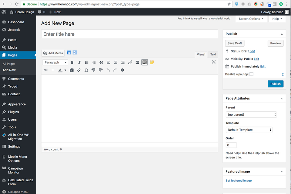
Most of the content in a WordPress site is held in either Pages, Posts or Media. A Page – the WordPress term for Page – is probably what you’re most familiar with in regular websites: it’s a static website page. Typically, pages are more-or-less permanent parts of your website, and typically the content included in your navigation menu: about us, contact, mission, services, get involved, donate, etc. Pages can have “parent pages” for logical grouping. For example, if you have an “About Us” page, you can nest other pages that have information about your organization, such as “Our Staff,” “Our Mission,” and “Our Board”; with “About Us” as the parent page, the link to Our Board, for example, would be https://www.yourdomain.org/about-us/board-of-directors. Descriptive URLs such as this are great for your SEO.

Posts, on the other hand, are the type of dynamic information that would appear in a feed: news articles, events, announcements, press releases, etc., and what most people associate with blogs. Posts can be organized by date, category, tag, and author; the default WordPress setting is to display them by date, newest first. They can include an excerpt, which is a shortened version that can be shown in a feed. Both Pages and Posts have the option to choose the author, publish date, and whether to allow comments, but typically these are only shown on Posts.

Both Pages and Posts include all standard WordPress editing tools (similar to Microsoft Word), and you can add images and videos to both. These images and videos, along with PDFs, are stored in your Media Library. You can add files from the Media Library or any Page or Post.

Some websites, including many of our larger custom-designed sites, also have additional categories of custom content called Custom Post Types – these are for storing information that have pretty consistently defined fields, and that you’ll need to display in a feed-like group. For example, in recent websites we’ve developed, we’ve created custom post types for coaches (of a swim team) and doctors (of a practice) so that we could display basic information for all on one master page, with links to each individual’s bio. Custom post types are generally added to a site by using a plugin.

Creating a Page or a Post is simple: add a title, add some content, add an image if you like. The WordPress editing screen is a lot like Microsoft Word, with buttons for bold, italic, bullets, etc. When you are finished adding content, hit the blue Publish button. In WordPress, Publish is the key to making your content public for the world to see. You can, of course, save your page or post as a draft and return later to finish it, if you prefer. But if you leave a Page or Post without hitting Publish or Save Draft, you’ll lose your work.


WordPress isn’t rocket science. Once you understand the basic terminology, get your site set up and start using in it, the sky really is the limit. My best advice for learning it? Get into a WordPress site and play with it. So, we’ve got an exclusive offer for Volare readers: if you would like a free WordPress test site, we’ll set one up for you. It’ll have the latest WordPress theme and our recommended plugins. You can’t use it for public information – your traffic will be limited – but you can play to your hearts content. It’s like flying … with a safety net.

To get your free test site, email us at [email protected], with “Free Test Site” in the subject line. Give us your name, a username to log in to your site, and a password. Within 24 hours, we’ll set up your site and send you the link.


Nonprofit website marketing

Is your non-profit losing money online?

Every day your website isn’t showcasing the very best your organization has to offer, you could be losing online donations, volunteers and new members.

From 2016 to 2017, online giving to non-profit organizations in the U.S. grew 12.1 percent — making an organization’s website an increasingly crucial part of it’s overall marketing and fundraising strategy.

A successful website invites your audience to get involved. What does an organization’s website need in order to engage visitors? Here are our top ten tips.

  1. Your branding impacts donations. According to a study by Network for Good, consistent branding across your website and marketing/communications can increase online donations by as much as 700 percent! ‘Consistent branding’ means that you use the same logo, with the exact same colors, layout and fonts, everywhere. The wording and abbreviation you use for your organization’s name and tagline should also be the same, every single time. Don’t ‘Google-ize’ your logo to fit different marketing campaigns; it muddies your message.Your logo (or organization name) should be in the top left corner of your website. Studies have shown that left-aligned logos on a website lead to greater brand and name recall than logos placed in the center or on the right. Left-aligned logos and website names are also better for navigation.
  2. Why do you exist? Your mission – the problem you solve – should be up front and easy for your first-time website visitors to see. Keep this first introduction short; you want to engage on your home page, not overwhelm.
  3. Mobile-friendly = donor-friendly. Your website should be responsive, meaning that it displays properly across different screens. You can safely assume that many of your website visitors’ first impression of your website will not be on a computer: In 2024, just over 57 percent of nonprofit website traffic came from mobile devices. However, only 25% of donations were made from mobile, indicating that a lot of organizations probably aren’t providing a mobile user experience that generates trust.
    Is your site mobile-friendly? You can check here:
  4. A picture is worth … a lot of money. Use high-quality images and video to tell stories that establish an emotional connection and show the impact your donors can have. Using pictures with human faces can increase engagement by over 30 percent.
  5. Give your donors peace of mind. Secure your site, even if your donations are processed on a different website. Sites that are secure have the little green padlock in the address bar, which you may have noticed. The Chrome browser, along with Firefox, Safari and Internet Explorer, show warnings on websites that aren’t using a secure ‘https’ connection. Website security is provided by a secure socket layer (SSL), which gives someone’s browser a bridge as a secure connection to your server, ensuring that any information is securely transferred.Search engines rank ‘secure’ websites higher than non-secure. A free SSL certificate from a company such as Cloudflare gives you the little green lock – and your website visitors peace of mind.
  6. Fast is good. Really, really good. Website visitors expect a site to load in two seconds. If your website hasn’t loaded after three seconds, half your visitors will leave your site. Plus, search engines, particularly Google, use page loading speed as part of their ranking algorithm. There are lots of ways to speed up your page loading times, including ‘minimizing’ the code used in your site, making images as small as possible (in bite-size, not display size), and using a content delivery network that delivers your website files from the closest possible location.
  7. Make it easy to give. Your donation form should be one click away from every page on your website, and that ‘click’ should be in an easy to spot DONATE call-to-action styled button.
  8. Let them volunteer on the spot. Use a short volunteer signup form to encourage online signups; if you need more information you can use a follow-up form via email.
  9. Update your content regularly. Delete or hide old events, and keep fundraising campaign information up-to-date. Nothing turns away website visitors faster than old information, and adding content regularly increases search engine optimization.
  10. Be social. Place icons with links to your social media pages at the top, along the side or in the footer on every page in your website to encourage website visitors to engage. Highlight your board of directors and staff with photos to let your potential donors, members and volunteers get to know you better, and keep your contact information easy to find, with both email addresses and a phone number.

Need help deciding what should be in your website? Give me 45 minutes, no strings attached, and I’ll save you hours of time. We’ll talk about what you need for your site, and I’ll help you put together a plan, even if you don’t sign up for our design services. Contact me at [email protected].

—Leslie Smith